Your Capitals are All Mixed Up
If you ever happened to look closely at movie posters or end credits, you recognize this style: names written in capitals with the first letter of words capitalized again.

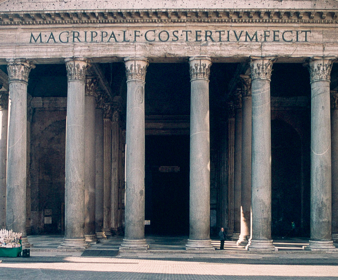
Of course capital letters are the origin of our alphabet. The Romans themselves used almost exactly the same alphabet as we do, except for U and J. They did not have lowercase letters though. The stout forms of their letters is strongly related to the way in which they were used: to inscribe names on public buildings and temples.
Movie poster credits have a similar monumental quality about them. And this is exactly what they communicate: power, strength, invincibility and durability.1

But why use capitals in two different sizes? Isn’t one size enough? In fact the smaller size capitals are not really capitals but ‘small caps’. Very aptly but also confusingly named, since these are not just uppercase letterforms which have been reduced in size.
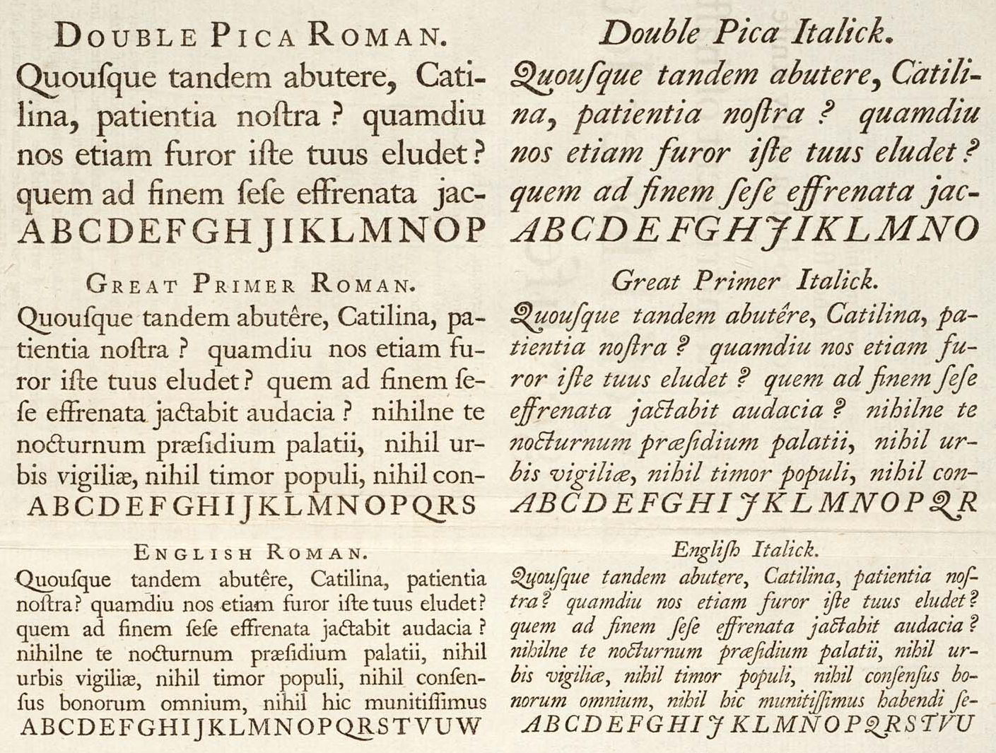
Small caps are defined as uppercase characters set at the same height and weight of surrounding lowercase letters. They were invented somewhere in the 17th century as a variation used for emphasizing words in a text. Because of HOW THEY ARE DRAWN, their forms fit in with normal set body text. Their height respects the vertical spacing between lines also known as vertical rhythm. Uppercase used at the beginning of sentences or words set in lowercase—or in other places depending on the ortography of the language—still stands out. And because their weight is corrected, the overall grey value is similar to that of the surrounding text.
This is not something a computer can just generate. Small cap forms need to be separately drawn by a type designer.2

As you can see above, the practice of using uppercase letters within small caps is nothing new. It is confined though to single words and headers. Another situation in which the combination might be forgiven is in the names of people, since one of the protagonists might get hostile when their names are not properly titlecased.
You can also see that small caps are not designed to be mixed with regular capitals. Regular capitals are designed to be combined with lowercase letters. Even though, this weird mix of caps and small caps is everywhere where designers and other people need to make a point.
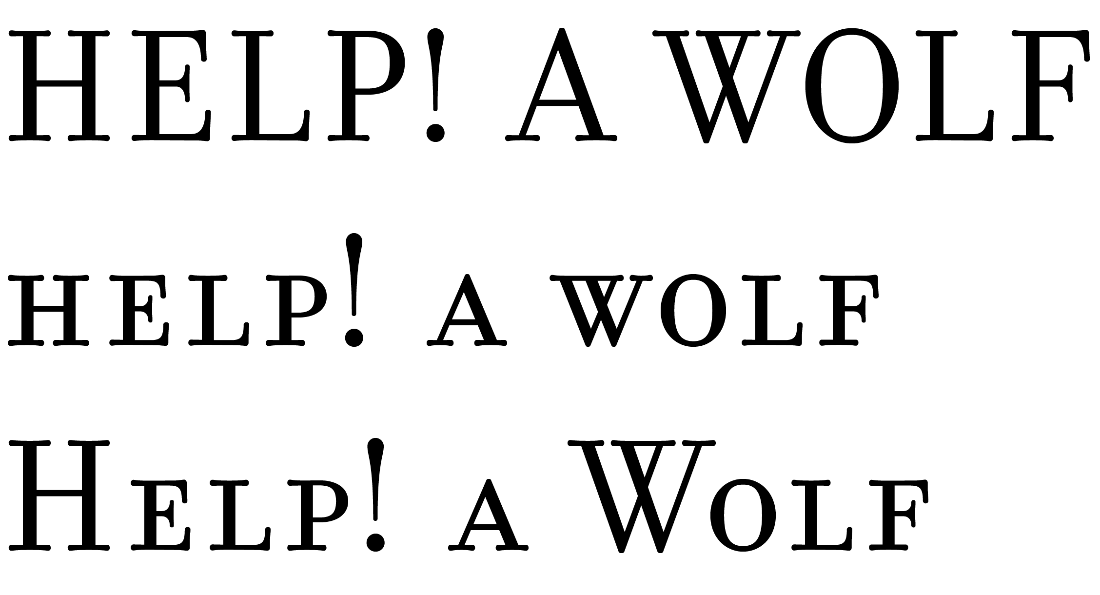
This is a bit like screaming all the time: all caps is very loud, small caps just a little bit less loud. The boy who cried wolf soon learned that screaming all the time soon looses meaning. For others to emphasize with your message, you need a certain dynamic. Mixing loud screams with screams a little less loud is not going to bring very much to the table. The contrast between them is not large enough. Compare these three examples:

What I’m hearing is:
- Houston, we’ve had a problem here!
- If you can spare a moment Houston, please look into our problem.
- Houston, I’m doing vocal chord exercises. Please do not consider the content of my words.
You might want to use 1, and sometimes you might use 2. Whatever you do, don’t go for three. The next time you need to cry wolf, please use a constant level.
Examples set in Emigre Filosofia Small Caps & Fractions.
- Also, in movie contracts often actors have a clause which states how large their name should be. ↩︎
- Often computer software like a word processor generates these forms, by taking capitals and sizing them at about 85%. This is problematic, for example since the resulting text will have thinner features than the original. ↩︎